Color Psychology in Films
The colors were introduced in films in the 20th century and since then they have changed the way films are watched. Colors not just captivate the spectators, but affect their psychology too. Over the years, colors made storytelling more engaging and impactful. The ancient Egyptians studied the effects of colors on the human brain and filmmakers further used them to elicit psychological reactions from the audience by connecting emotionally with them. Having said that, the colors in the film do more than represent character traits and story arcs set the tone of the movie and draw focus to important elements.
Patti Bellantoni in her book If It’s Purple, Someone’s Gonna Die writes, “Seeing a movie demands skill that watching a movie doesn’t.” She further explains each color affects us uniquely. Even the slightest variation of a single color can have a profound influence on our behavior. In wise hands, color can become a powerful tool for filmmakers to subliminally layer a story – to make a situation ironic or absurd. Hence, filmmakers can pragmatically verify a desired emotional response to color.
Although music and onscreen action are considered more controlling components of cinema experiences, the use of color to depict film sets and characters is equally compelling if not a more nuanced tool in the right hands. The use of color is subjective to a filmmaker’s style and narrative. Each filmmaker uses the color in their own way to convey their stories in the most impactful way. The colors do not just accentuate and beautify the film by building an emotional and psychological connection with the audience but also represent the film’s physical world and the character’s mental state. For instance:
- Associative Color is used to depict a Character, Emotion, or Theme.
- Discordant Color is used to refocus the viewer’s attention on an important Person, Place, or Thing. It helps a character, detail, or moment stand out in the film.
- Transitional Colour is used to represent a change in a Character or Theme.
Each color emotes a different range of emotions. For example:
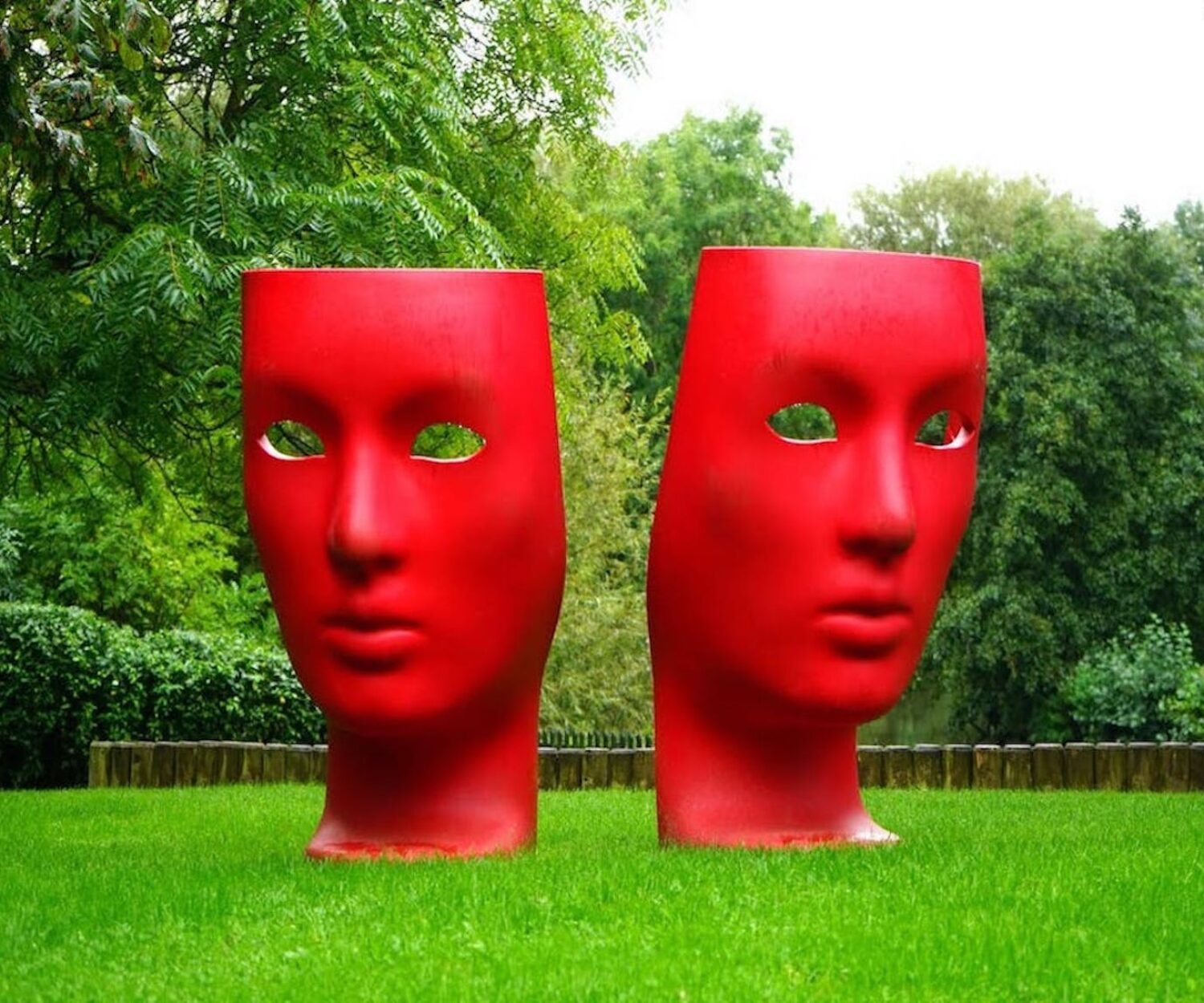
Red Color Psychology:
RED is associated with love, desire, violence, aggression, and power. It also evokes fear, anger, and anxiety. The balanced use of red color in frames can make them visually beautiful and convey deep emotions. The red shirt of Joaquin Phoneix in the movie Her and the red hair of Franka Potente in Run Lola Run portray completely different meanings and emotions.
Orange Color Psychology:
ORANGE denotes warmth, enthusiasm, friendliness, and happiness. The perfect use of orange can be seen in the movies like Blade Runner 2049 and Dune. The exotic attribute of the orange color also depicts nostalgia and is associated with memories.
Yellow Color Psychology:
YELLOW signifies madness, illness, insecurity, obsession, wisdom, and betrayal. Yellow seeks attention and is used to attract eyes. The energy of yellow in Kill Bill represents courage as the yellow color in Japanese culture is associated with courage and wisdom.
Green Color Psychology:
GREEN is associated with the environment, immaturity, corruption, ominousness, darkness, and envy. There are positive greens and negative greens. Both convey opposite meanings in films. The natural and vital use of the green color can be seen in the movie Saving Private Ryan and the ominous use is very well portrayed in Hereditary.
White Color Psychology:
WHITE is associated with purity, innocence, youth, birth, sterility, peace, and calm. The combination of white with black portrays the contrast of characters, worlds, and emotions.
Purple Color Psychology:
PURPLE is associated with fantasy, ethereal, erotic, royalty, mystical, and power. Patti Bellantoni’s book the title “If it’s purple, someone’s gonna die” is a self-explanatory term about the use of the color purple in the film. The eroticism and mysticism of the color purple are very well portrayed in the films Cabaret and Rushmore.
The Colour Wheel & Scheme :
The color scheme is the combination of multiple colors to communicate the thematic context. The four most common types of balanced color schemes are Monochromatic, Complementary, Analogous, and Triadic.
There are many variations of passages of lorem ipsum available, but the majority have suffered alteration in some form, by injected humour, or randomised words which don’t look even slightly believable. If you are going to use a passage of lorem ipsum, you need to be sure there isn’t anything embarrassing hidden in the middle of text.
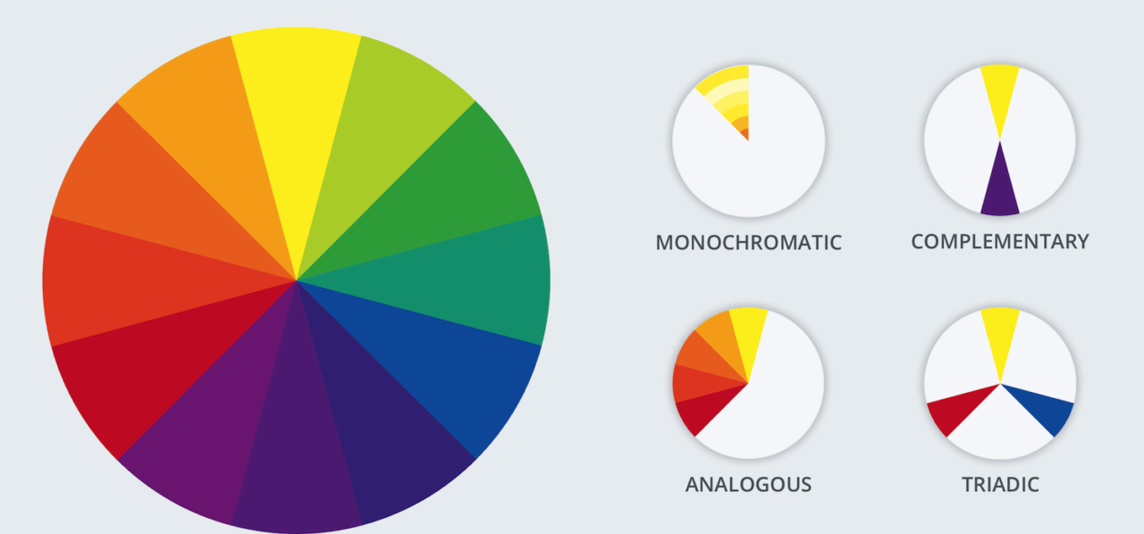
Monochromatic:
The monochromatic color scheme is using a single color throughout, along with variations of the color’s shades, tints, and tones. A monochromatic palette is minimalist and visually smooth.
Analogous:
The analogous scheme is made of colors that are adjacent to each other on the color wheel. An analogous palette is harmonious and calming since the colors are related to hues.
Complementary:
The complementary scheme is made of colors that are opposite to each other on the color wheel. When placed adjacent to each other, these complementary colors appear brighter. On the contrary, when mixed, they have the opposite effect, neutralizing or graying each other.
Triadic:
The triadic color scheme uses three colors equally spaced on the color wheel. A Triadic palette is vivid and well-balanced and there is ample color contrast and a natural color balance.
Summary:
The importance of colors in life is inevitable. Hence, colors are very important tools at the filmmaker’s disposal that can set moods and build emotional connections with the audience. Two to three key colors will help you sustain your message in the audience’s mind whereas more colors can create visual disharmony and chaos. Therefore, color palettes are made at the pre-production stage of the film. Mood boards and concept art are great tools for communicating color palettes. However, there are no ideal sets of colors. Colors are there to help filmmakers and storytellers not to confine their vision and imagination. Hence, use the colors wisely and thoughtfully but there is no harm in breaking the rules.